
Graphic Design Portfolio–Here’s a snapshot of some of my latest work.
Every week, I plan on doing a little show ‘n tell time. This weekly feature will display some of my latest work and explain the process of creativity.
Last month, I had the privilege of working on a book cover design for my client Tammie Polk.
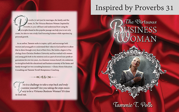
Since the book was inspired by Proverbs 31, I decided to find a red cloth background. To me, that encapsulated the character of the woman the chapter describers. I like to call her “Ruby.”
I found a picture of a pleasant business woman looking up to the sky. It contrasted well with the red background. I wanted an ornate silver frame to give it a feminine touch.
My font choice combined feminine with class and a touch of bling. I chose an outer glow around the letters B and W and made those letters bigger to give it more punch.
I tucked “The Virtuous” within “Business Woman” to give it a grounded look. It is a neat, tight unit. Classy and readable.
For the back cover, I used drop cops to make the cover attractive. I copied the red cloth layer and cut out the middle portion, feathering it and lowering the opacity so the lower red cloth layer can be seen. I made sure the contrast was high enough to still be readable.
Last report from my customer was that this book was leading to some amazing opportunities for her. I would imagine that the professional cover had a little bit to do with this!
Would you like to see more of my portfolio? Click here to watch my slide show.